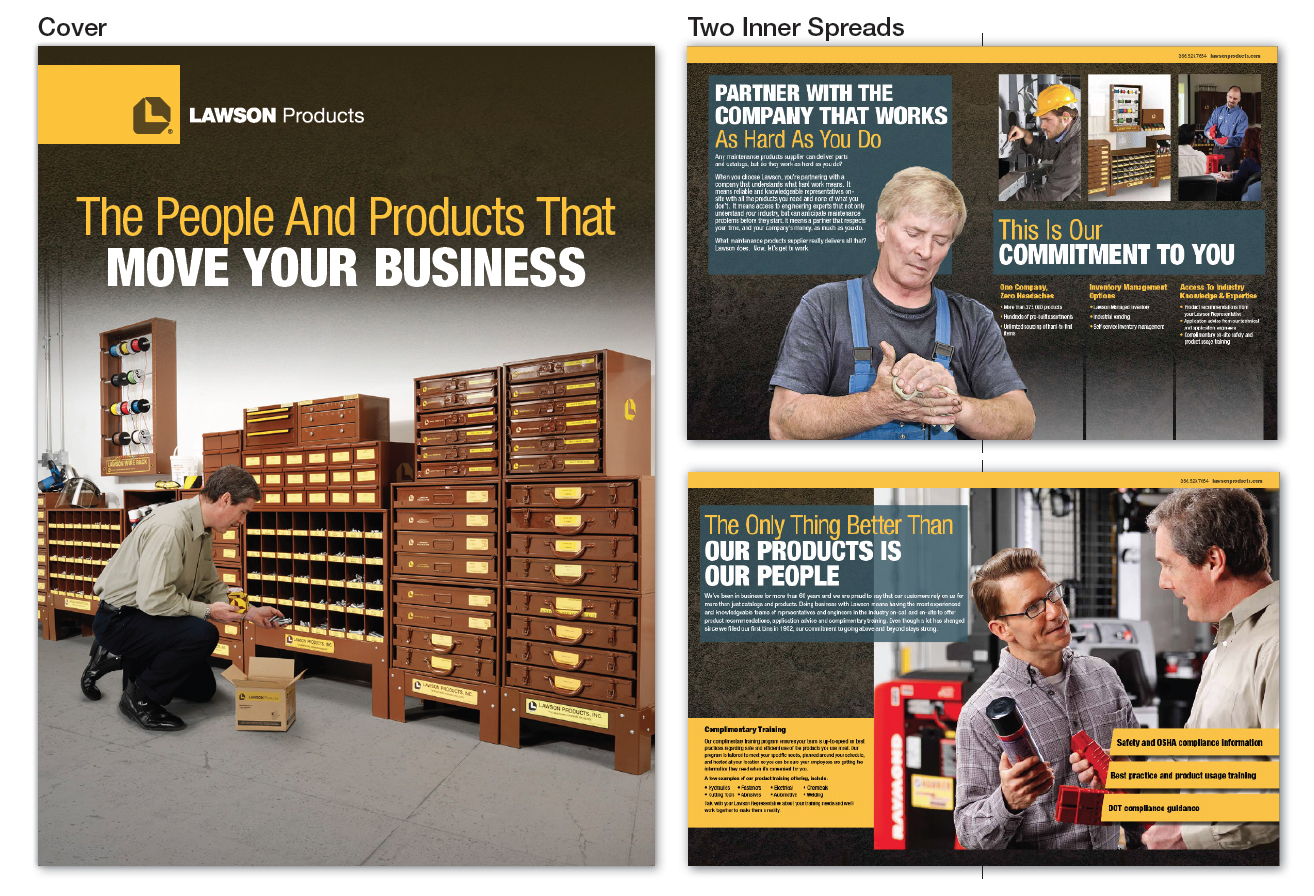
Working with my managers in the marketing department I revamped the design of the Lawson Products Corporate Brochure. This is the main document sales representatives use to introduce the company.

Lawson Company Brochure 2013. CLIENT: Lawson Products, Inc. INVOLVEMENT: I designed the layout, graphic style, branding and worked on production and image retouching
I brought a strong industrial look and feel to the piece that corresponds perfectly with the messaging “Partner with the company that works as hard as you do.” The overall design elements are a continuation of the elements I created for the main Lawson Products catalog cover and the Fleet Brochure launched earlier in 2013. It included the rich metallic texture, bold yellow stripes and the inclusion of a new tertiary blue brand color. I saved the team money by creating a cover for the brochure by comping existing images in Photoshop. I feel the result was a professional looking cover featuring the Lawson “Brown Wall” bins and a hardworking Lawson representative.

Brochure cover design
Inside the brochure, I also comped the mechanic on the first inside spread. We needed an image of a mechanic with dirty hands and I was able to find a stock art image of a mechanic. But it still wasn’t quite right. The man was a bit older than the demographic we wanted to feature in this particular situation and his red shirt didn’t fit in with the look of the spread. So I retouched the image, making his hands look a little dirtier, took a few years off his face and even changed his shirt from red to blue. My team and I received, and continue to receive, positive feedback for this new corporate brochure. One of our sales leaders even commented that it was “the best looking piece we’ve ever released.”

Brochure Layout