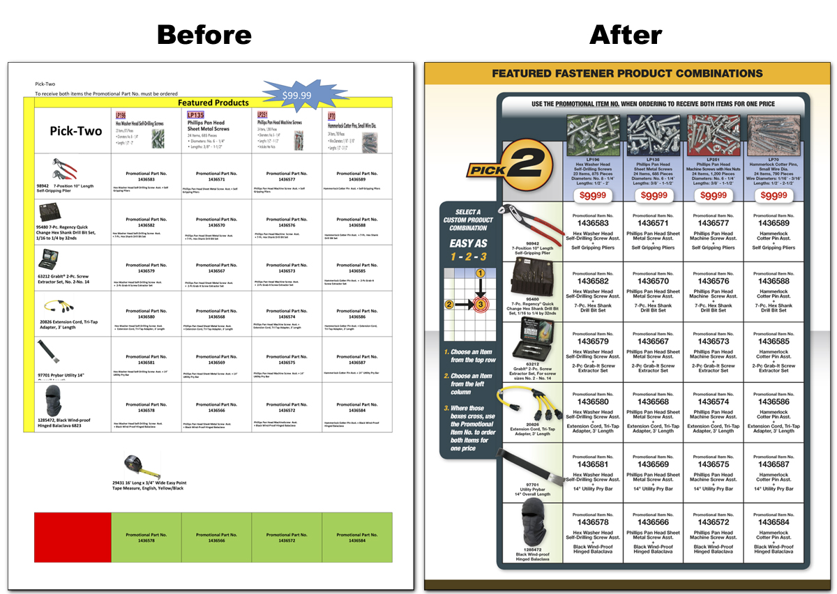
I always try to keep an open mind, and look for unique ways of solving problems. One example of this was when the product managers at Lawson Products wanted me to create a flyer with a grid where customers could select various combinations of bundles. This was the first time we’ve done something like this. The product managers provided me with just a spreadsheet with all the product information they needed to show.

Before and After
It was a challenge to find the best way to visually display the grid information as well as communicate to the customer how to use it to pick a bundle. All those requirements were further limited by the small amount of space, only two pages to feature 20 items and the 48 bundle item numbers.

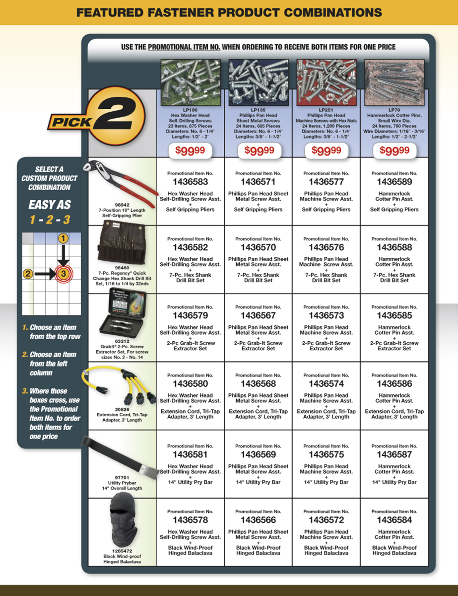
Pick 2 Bundle Flyer Design
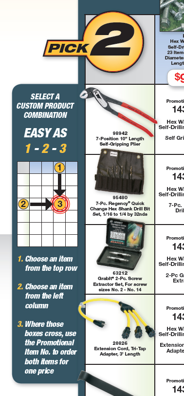
My solution was to create a clean, uncluttered chart of the information, enhanced with product images. Then, to communicate to the customers (and our sales force) how to use the chart, I created an easy 3 step diagram on the side panel. I also created a special graphic for the title “PICK 2” to differentiate this promotion for other campaigns. The product managers were very please with the result. We also received positive feedback from the sales force saying they were impressed that we took all that information and made it visually clear and easy to use.

Directions side panel