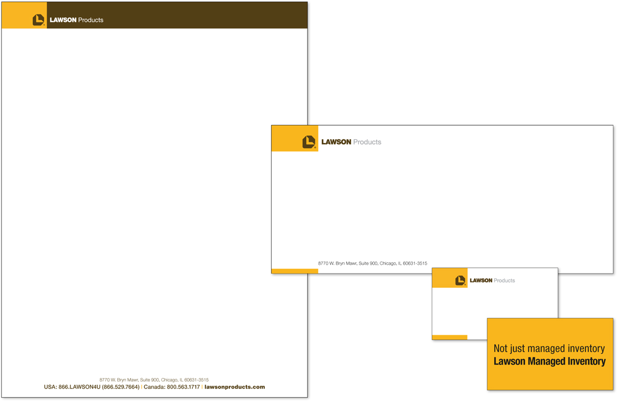
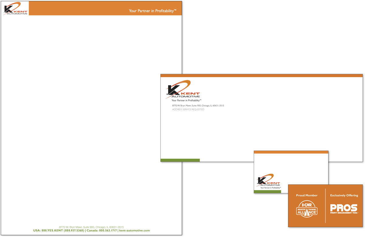
When faced with the challenge of updating a corporate identity kit (letterhead, envelope, business card, presentation slides, etc.) of an existing brand, it’s important to look at elements that were previously used that hold brand equity and customer recognition. In my case, I was tasked to update the corporate identity kit for Lawson Products and it’s sub-brand Kent Automotive. These two brands look very different and are targeting different customer audiences. Yet, the company leadership wanted to maintain some continuity between the two identities such as the structure of the layout. My solution was to keep the elements that were most recognizable; the brand logos and brand colors. However, I revised the layouts to be a little cleaner and allow for more white space for the document content. The resulting feedback I received was that the identity kit maintained the basic brand elements that were important to the company while adding a fresh layout.

Lawson Products and Kent Automotive Corporate Identity Kit – Stationary, Envelop, Business Cards. CLIENT: Lawson Products, Inc. INVOLVEMENT: Creative Concept development

Lawson Products and Kent Automotive Corporate Identity Kit – Stationary, Envelop, Business Cards. CLIENT: Lawson Products, Inc. INVOLVEMENT: Creative Concept development